Redesigning Vancouver's carbon reporting system resulted in cutting support cost by 65%
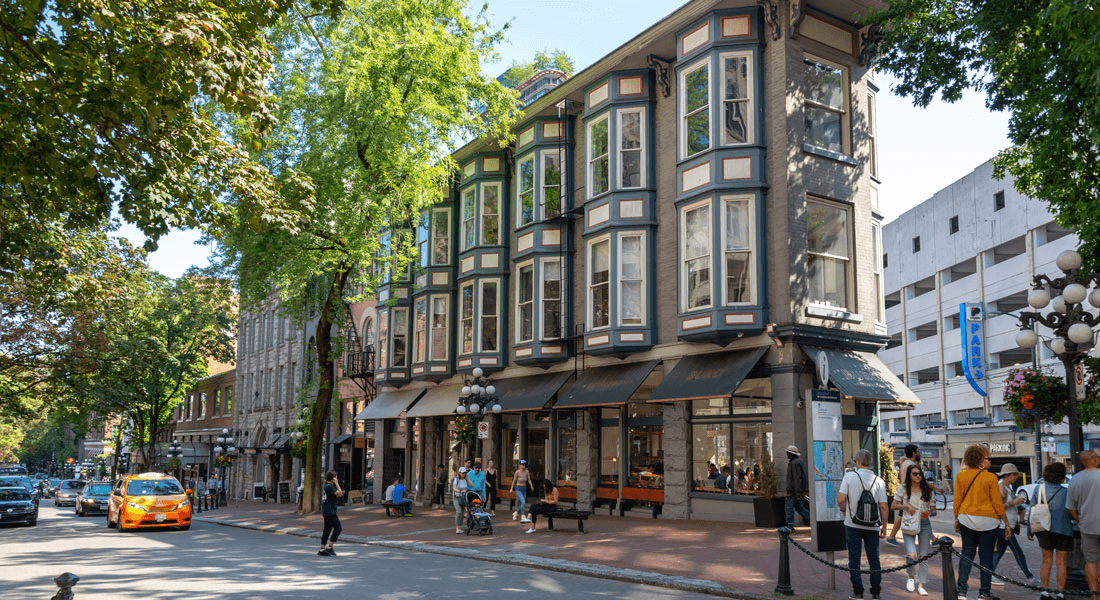
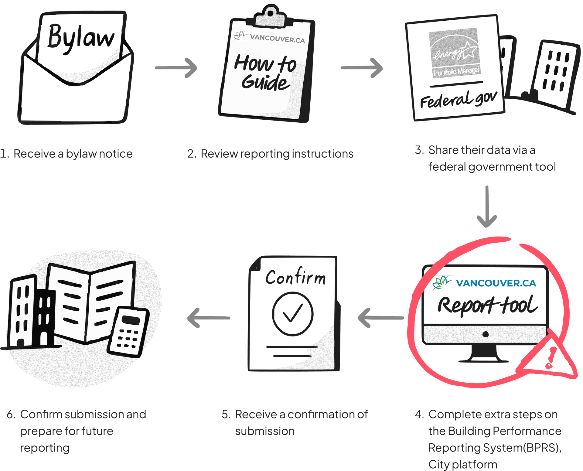
New regulation introduced to building owners: Energize Vancouver, a part of the city's sustainability regulations to reduce the carbon pollution.
My role
- Lead UX Strategist
- Researcher
Teams
- Project manager
- Content strategist
- Third-party developers
Timeline
Nov 2023 - Feb 2024
(4 months)
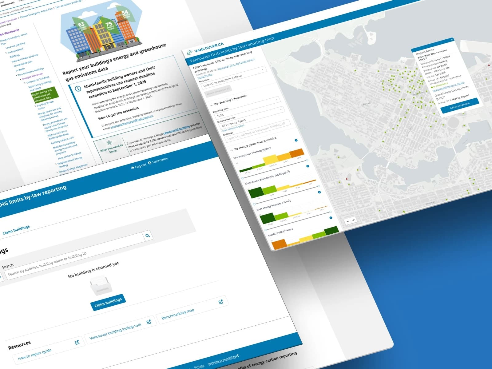
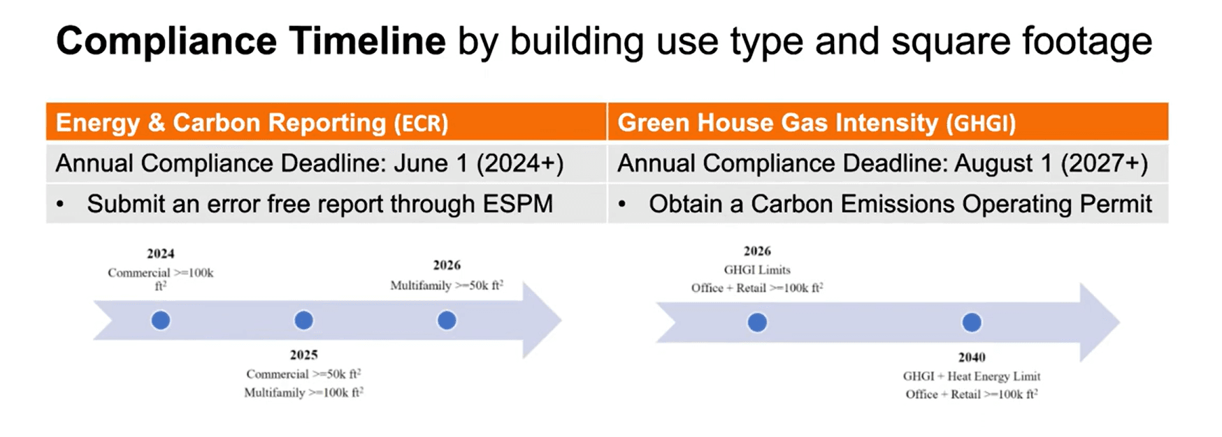
A sustainability regulation to keep the city greener and healthier by regulating carbon emission. Building owners are asked to report their carbon emission through online.
The business goal
A 90% compliance rate by the initial deadline.

The design goal
Make this complex green building regulation reporting process accessible for building owners.
What impact did we make?
Compliance rate by the initial deadline
support cost reduction
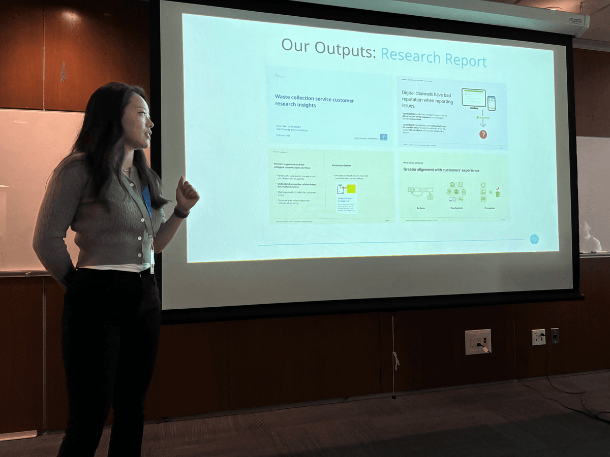
The first in-house research done, set a new user-centric framework and present it in the digital department
Behind the scenes of the redesign
The trigger
What signalled the problem
The approach
How we investigated
The insights
What we discovered
The solution
Themes & representative designs
We decided to improve the city's reporting process, here is why:
 Background
A surge in support calls revealed something was off about the City's reporting tool
We expected that if the high volume of support calls persists, it will result in a more significant cost impact in the future
~ 212
x 7.6 times
~ 1,527
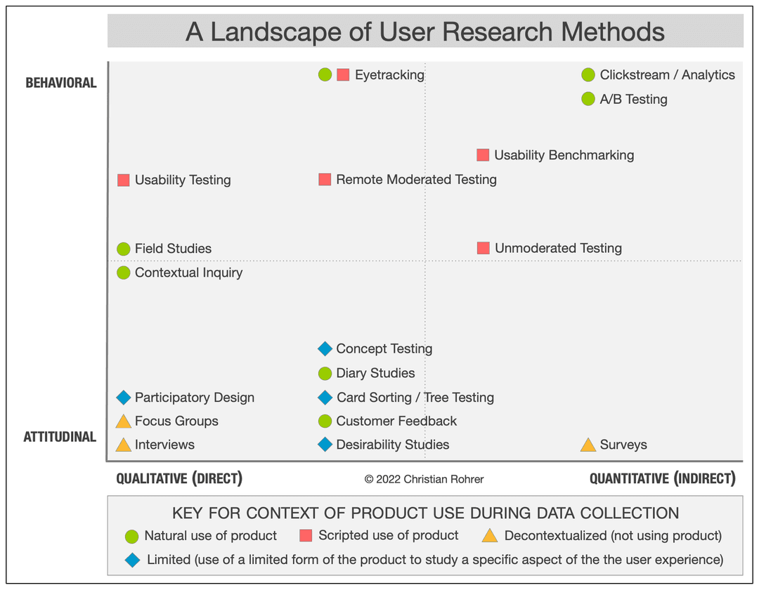
Then we chose the right research to identify what aspects are not supporting users
We conducted and utilized: Contextual inquiries (Qualitative) / Heuristic evaluation (Expert analysis) / CX data (Quantitative metric)
I conducted contextual inquiries with 5 users of varied roles and expertise levels

Engaged with 5 users — 3 experts, 2 novices — through one-on-one moderated sessions to observe how they navigated the reporting tool in real contexts.

Expert
ESRG Program coordinator

Expert
Building energy system initiative

Expert
Director of energy and commissioning

Novice
Energy analyst

Novice
Administrative support
I uncovered 3 incorrect assumptions from contextual inquiries & CX data
 User groups
 Guidance
 Expertise level
72% of users are third party consultants, not building owners
After inquiries, we wondered if it was coincidence that none of our recruits were building owners. Upon further examination of CX data, it was confirmed: 72% are third-party consultants.
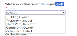
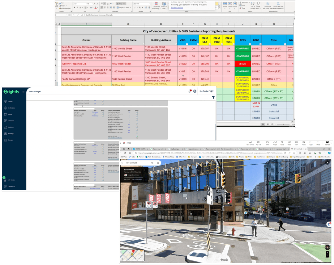
They are dealing with multiple buildings and have little access to the building data
Consultants managing multiple buildings lack direct access to granular building data, requiring significant back-and-forth to gather the information needed.
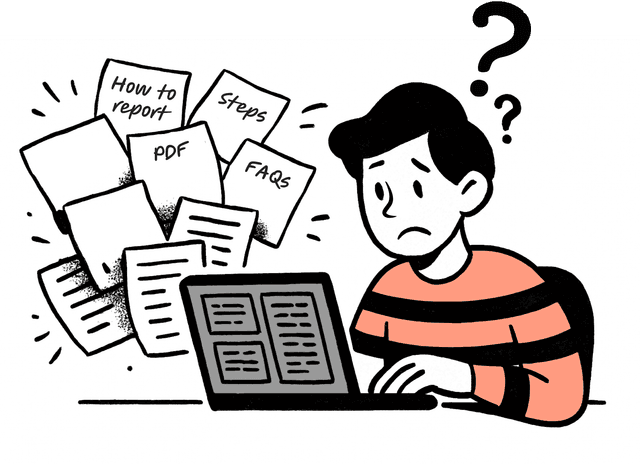
Static instructions, website, PDFs and FAQs, didn't help users move forward, but overwhelmed users
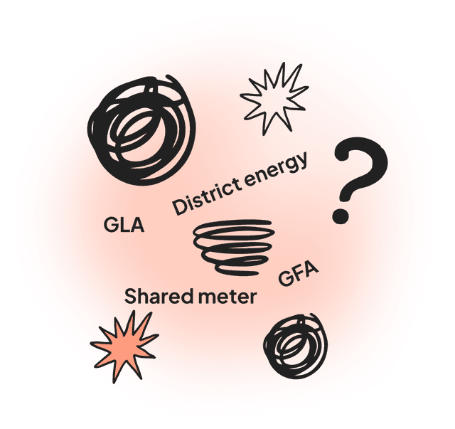
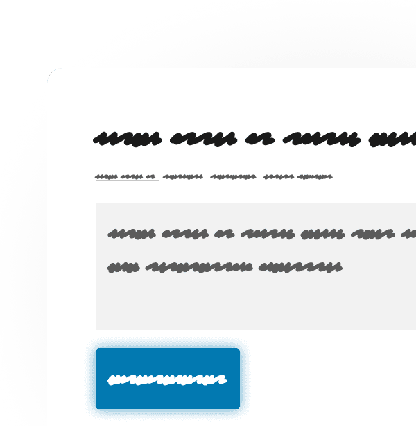
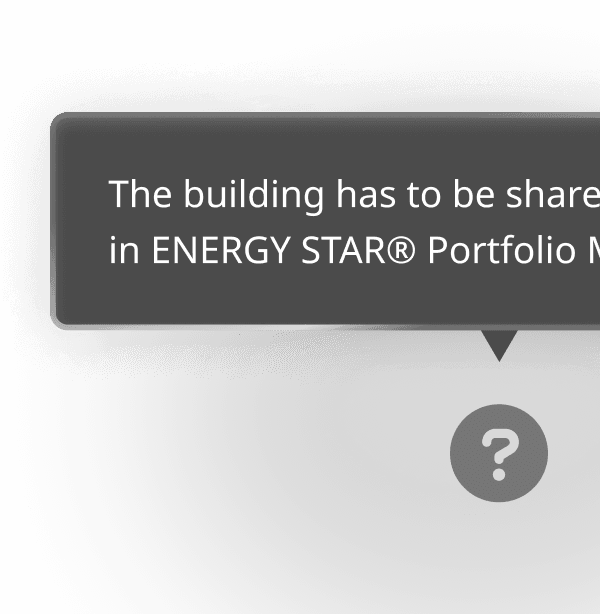
Technical jargon confused novice users and even experts
Novice users felt overwhelmed by jargon like "district energy" — but even experienced consultants paused on unfamiliar regulatory terms.
Overarching themes: the reporting tool must
Offer a clear visual affordance on UI level
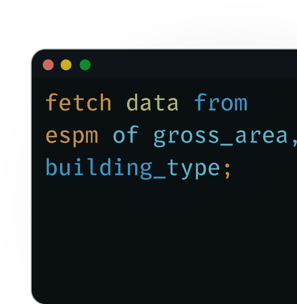
Reduce manual work by fetching data from federal government
Support users with different levels of expertise
Clear visual affordance on UI level
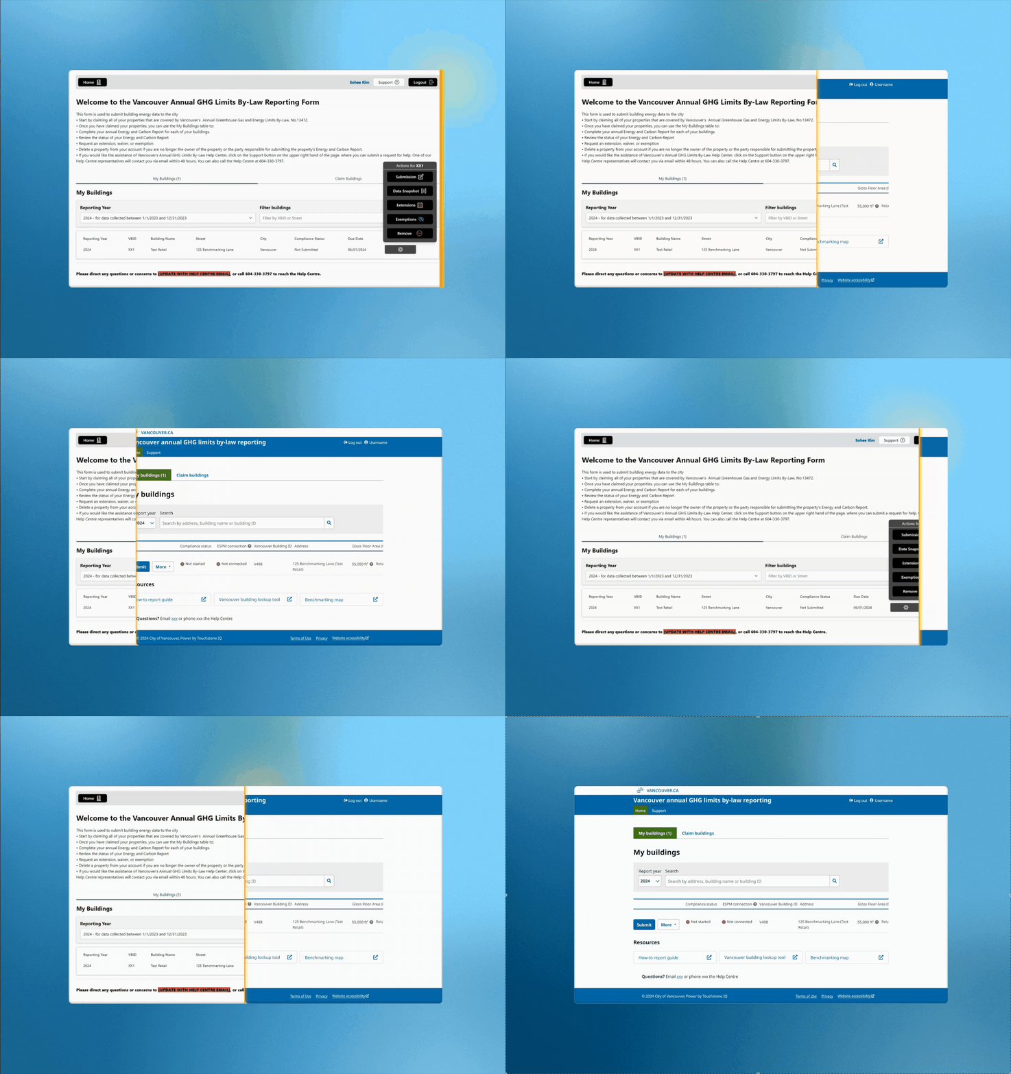
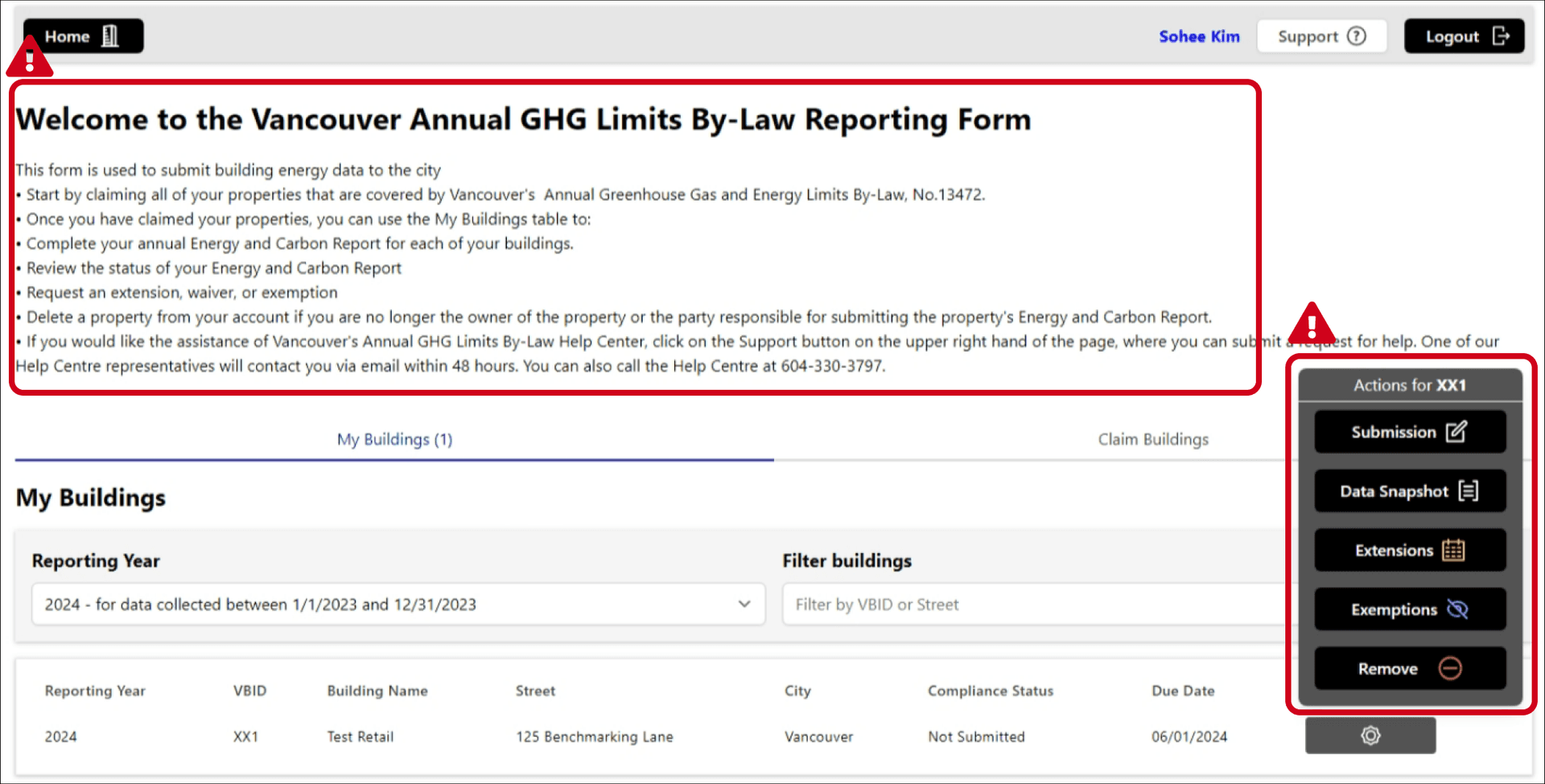
Home screen: dense with instructional text and it blocks the actual task.
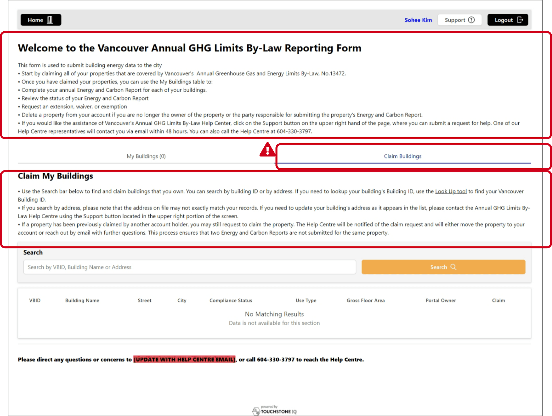
Home screen: The main task 'Submission' isn't prioritized and looks like secondary actions.
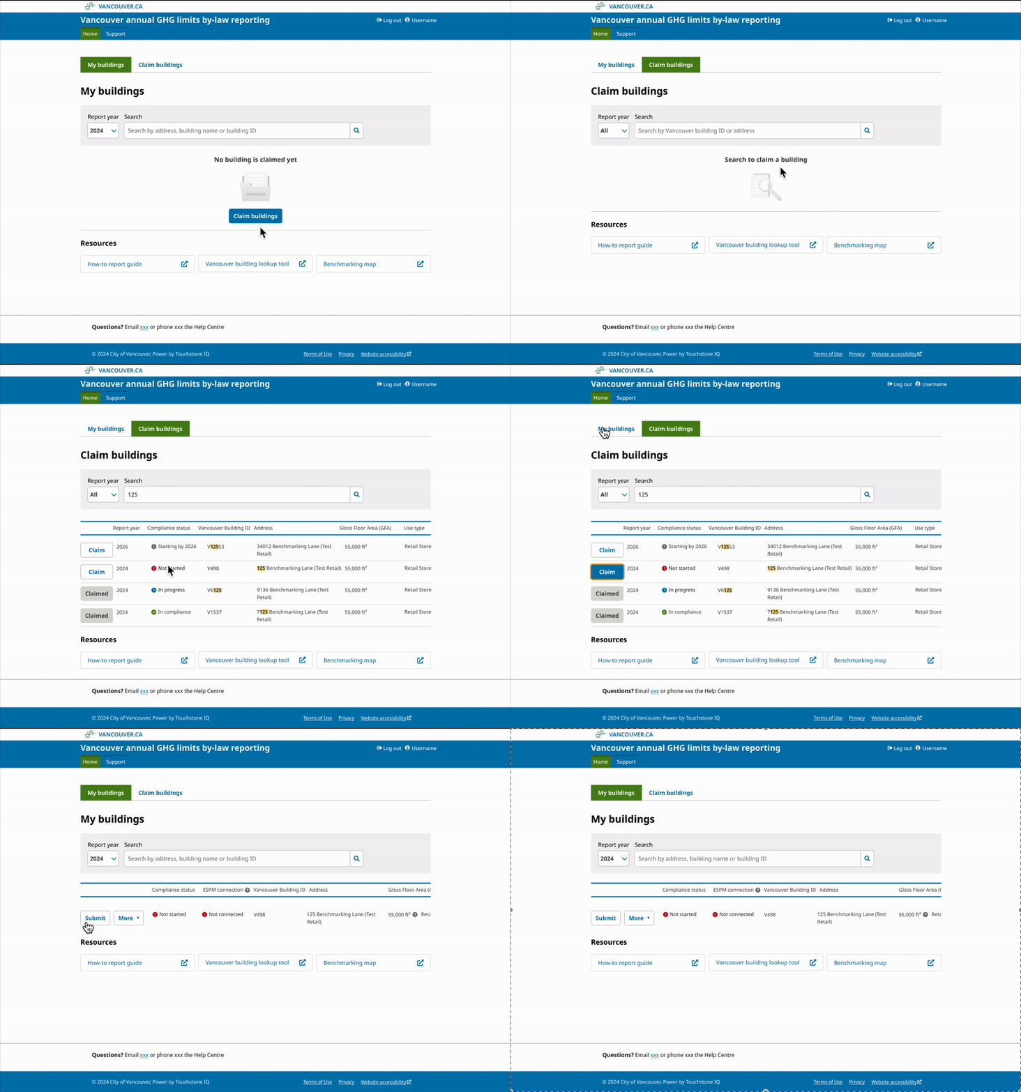
The screen now focuses on one core task with resources below. This reduces cognitive fatigue.
The task to start with ('Claim buildings') is now visible and centred.
Reduce manual work by fetching data from federal government
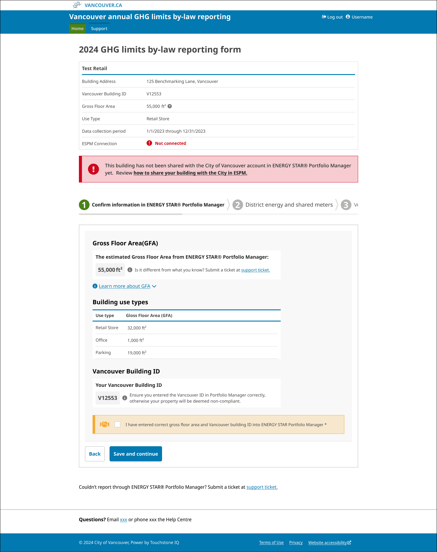
Users had to manually look up and enter data from external federal government sources, creating friction and errors.
We integrated a federal data fetch so the system pre-fills building information automatically, reducing manual input significantly.
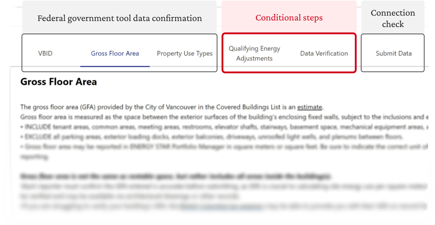
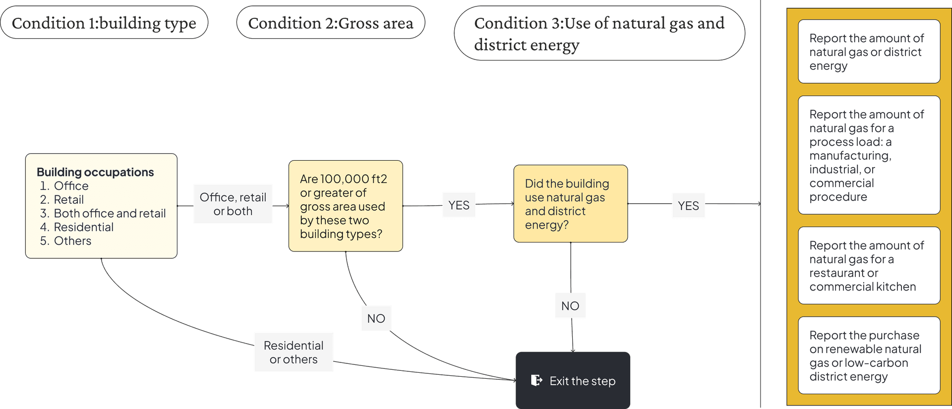
The system showed the same steps for all users, it was unnecessary for some.
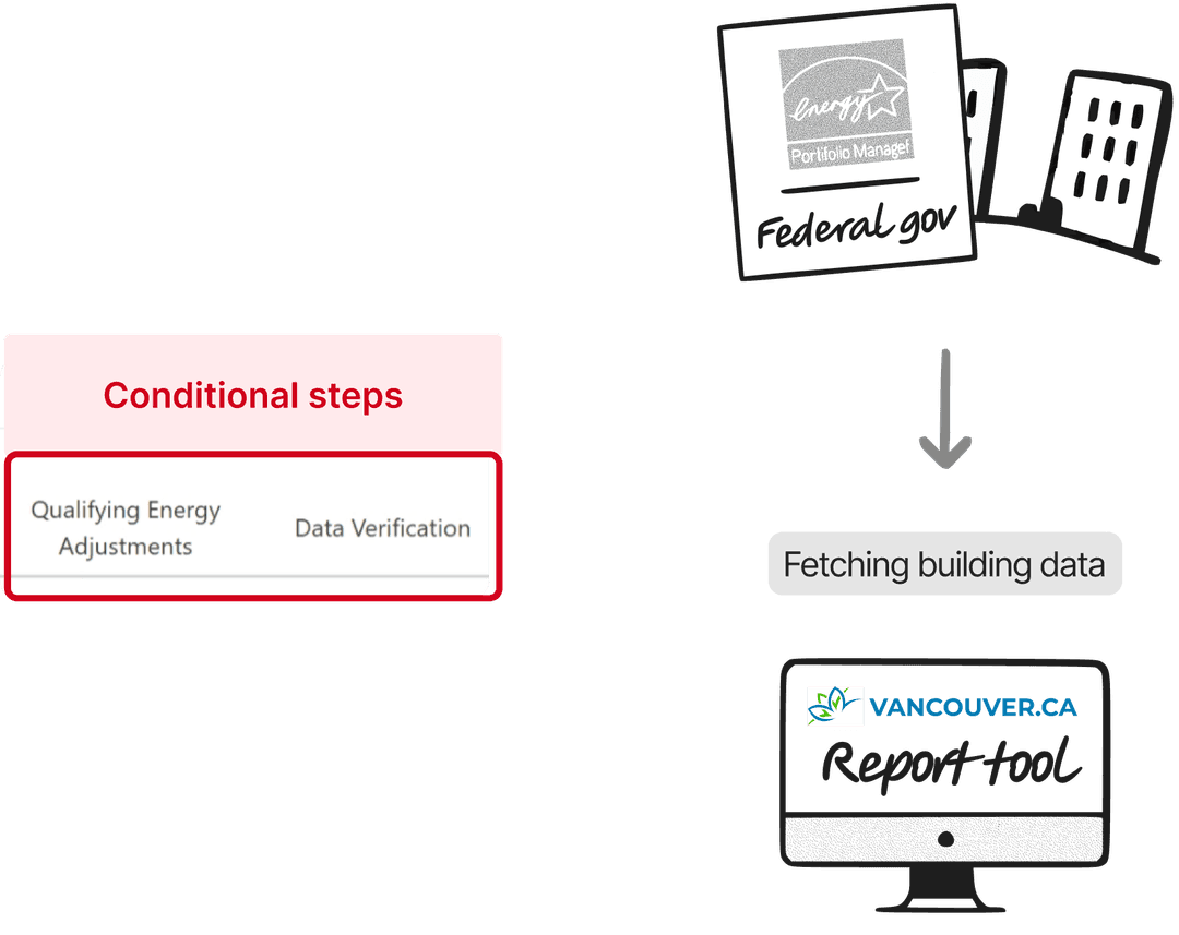
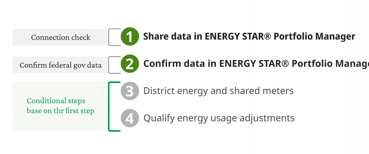
I looked at what data we are fetching from federal government and mapped which steps were truly necessary per user type.
Now, it displays conditionally certain steps, so users face only necessary steps
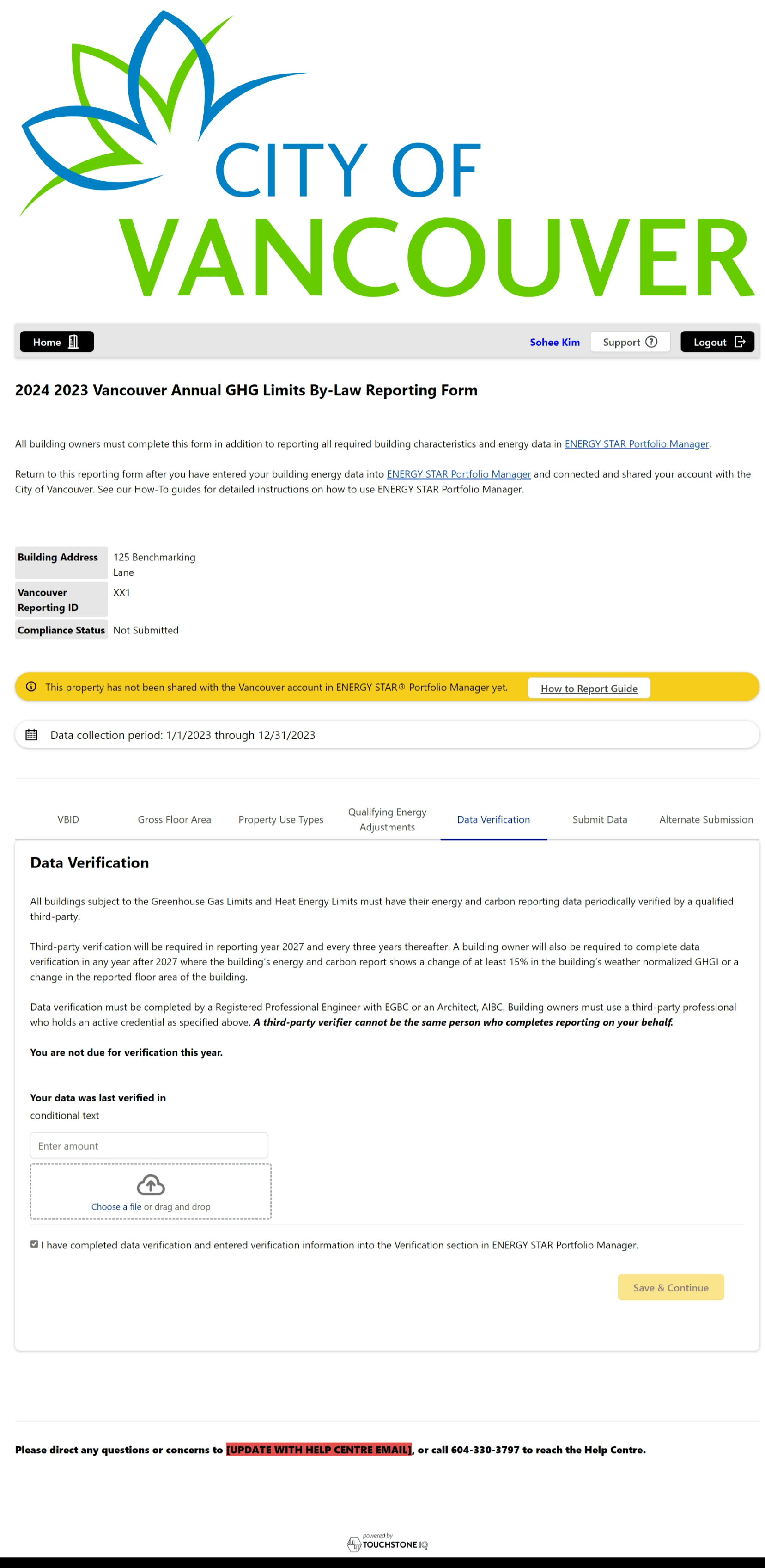
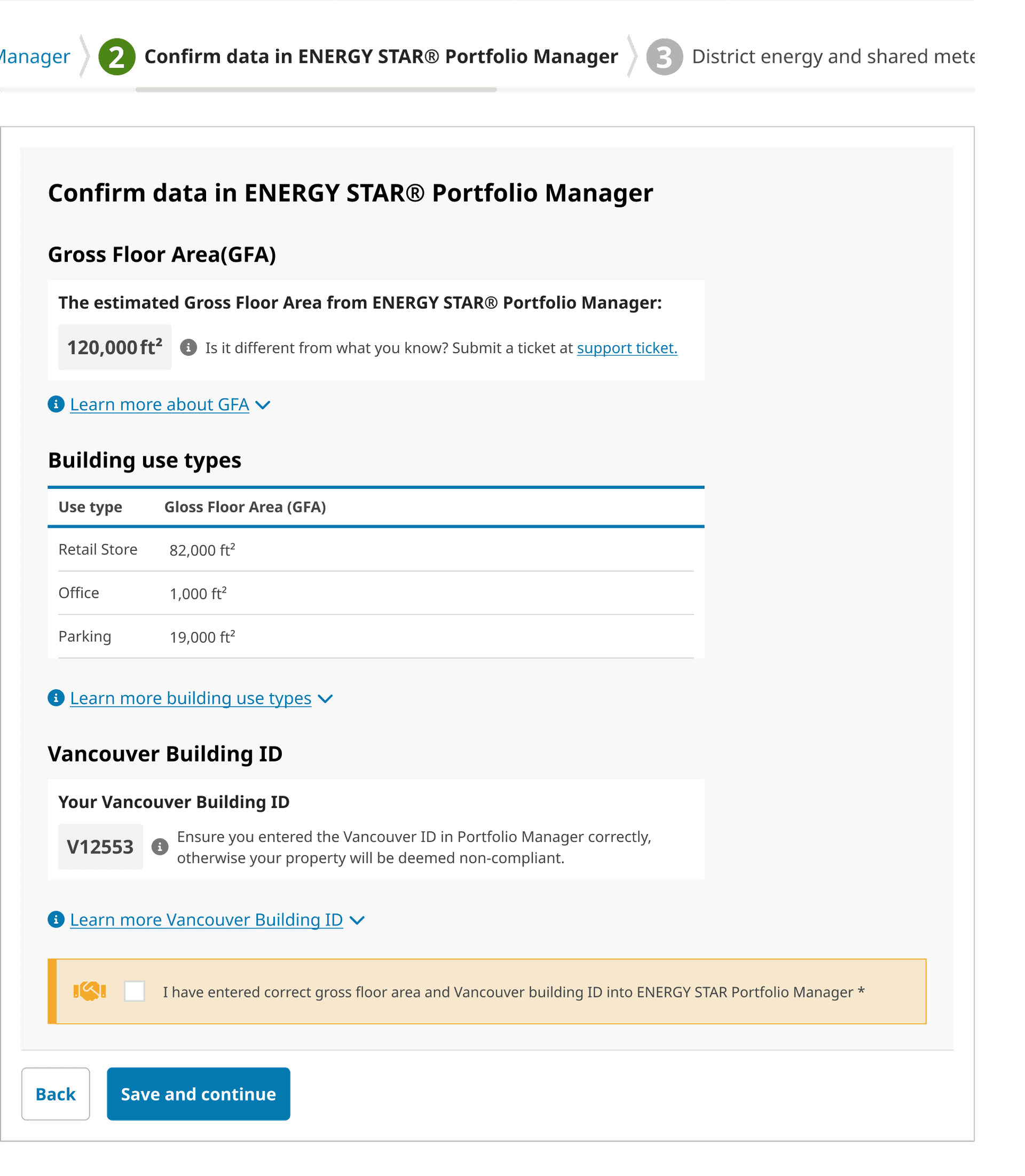
A gap between the users' main task and content in the steps: verifying data vs broad definitions
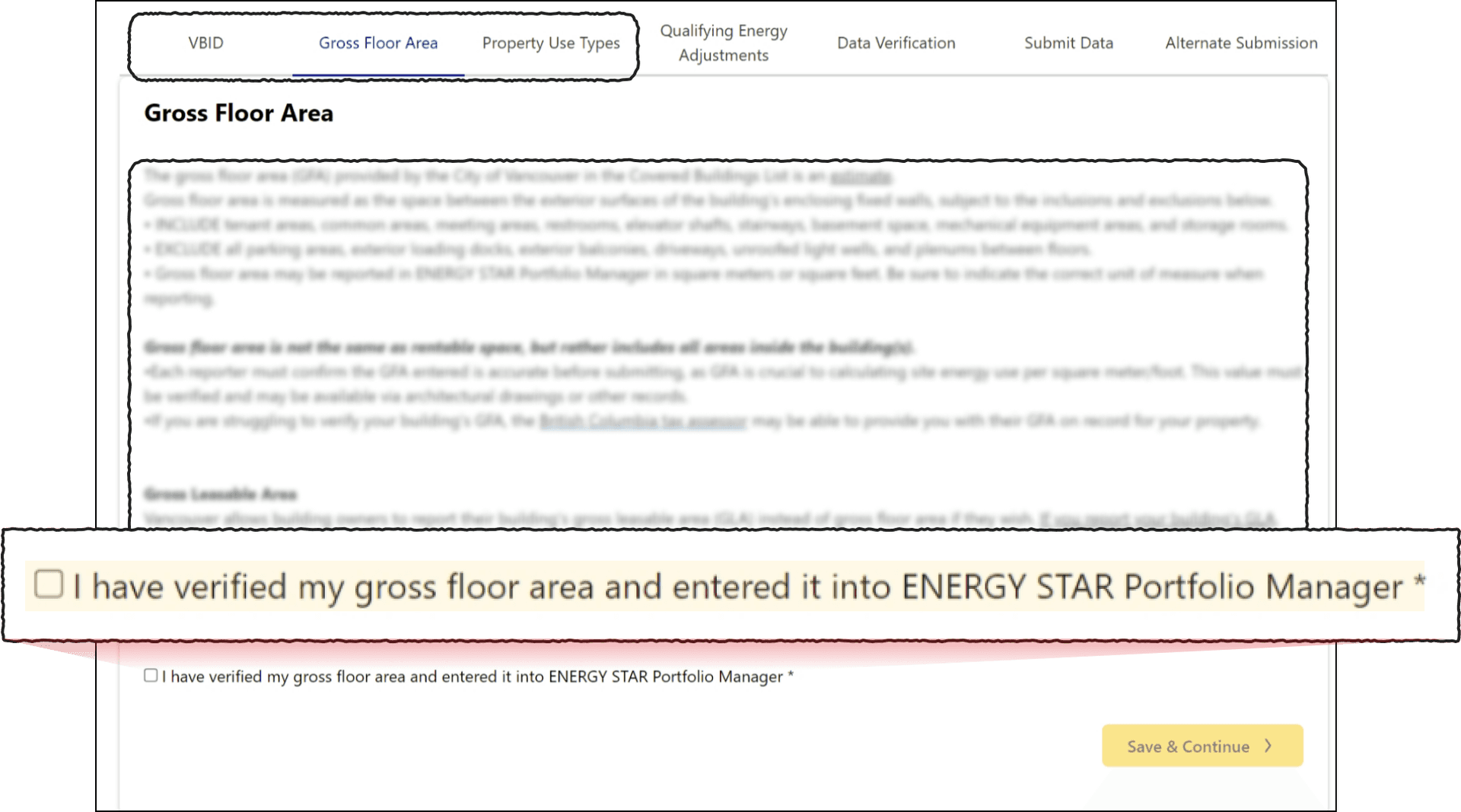
It displays the user's actual data for easy verification
Extensive forms challenged users to complete the task
Quotes from users:
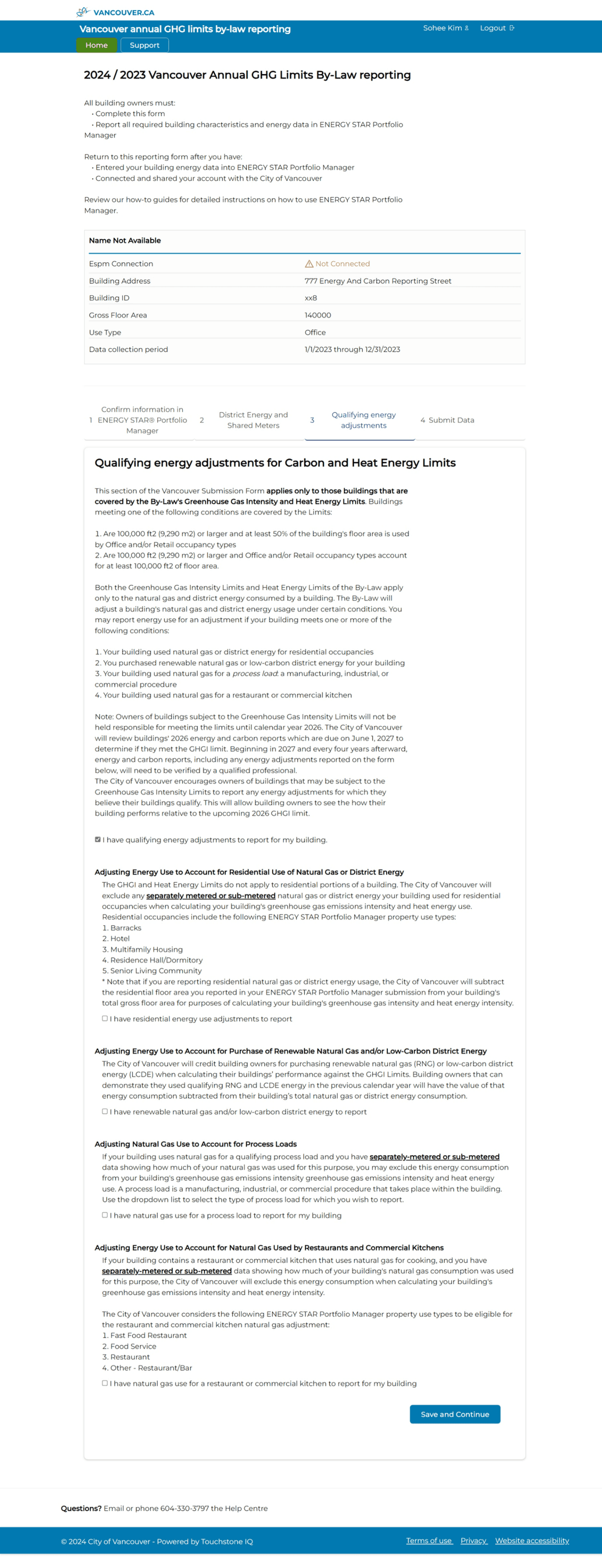

"Reading this is a lot..."
"Ok, this is a lot to read."
"I'm a bit hung up..."
"This is really challenging."
Three conditions that filter who actually need to answer these questions
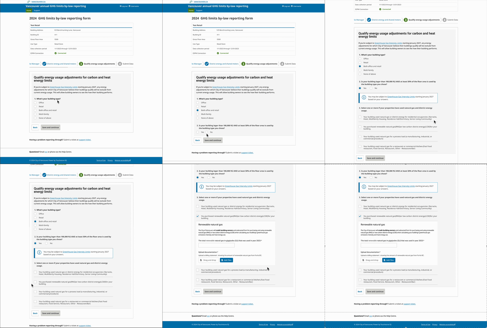
I broke down long forms into multi-step flows...
Solutions:
Long single-page forms were restructured into guided multi-step flows with clear progress indicators, reducing overwhelm and error rates.
Support for users with different levels of expertise
Users had to refer back to the guide PDFs or website for technical terms clarification.
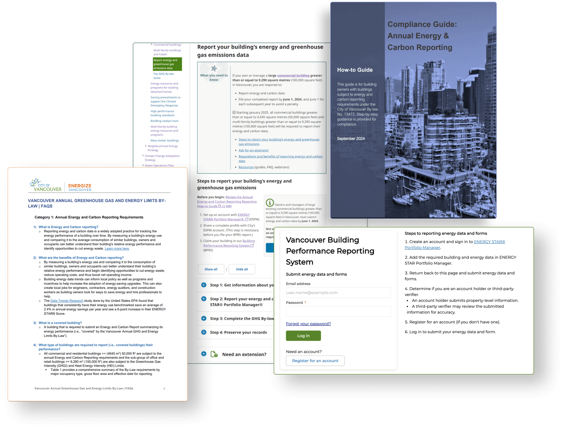
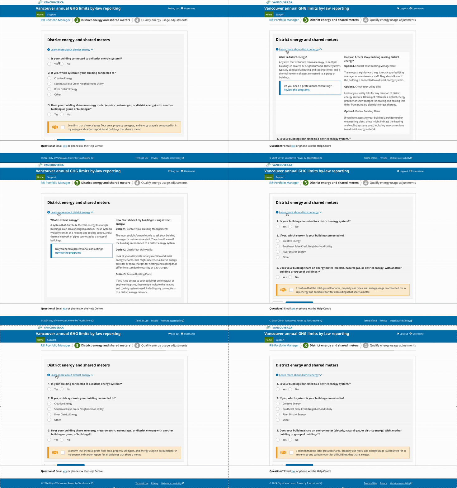
Present technical terms for accuracy by default, with simplified explanations available on demand.
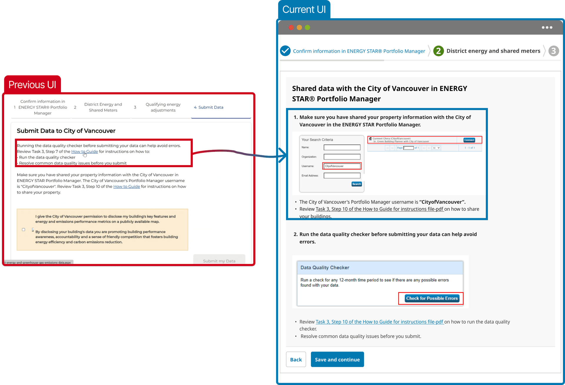
Included actual product screenshots on the most challenging step
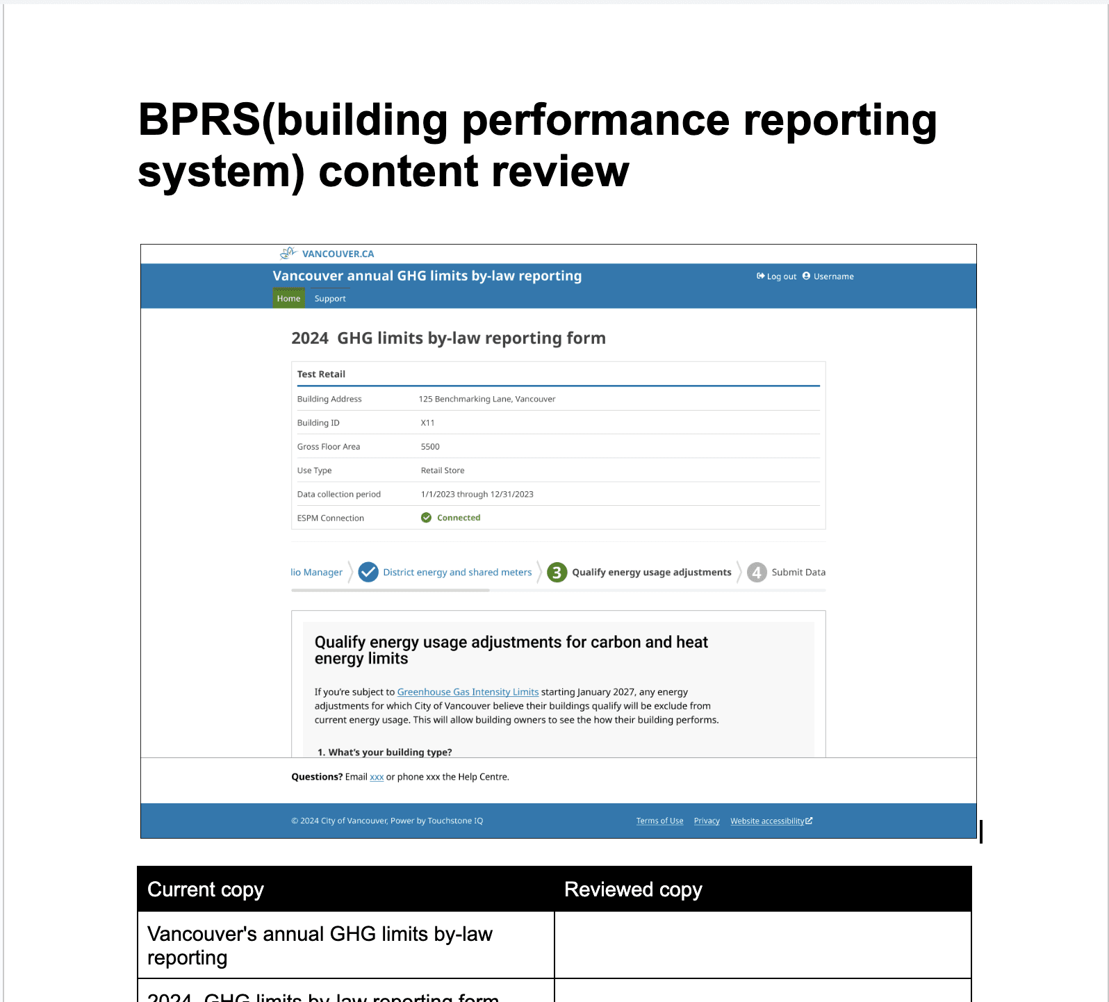
I collaborated with a content strategist to audit interface copy and rewrite it in plain language
What impact did we make?
94% of building owners submitted their reports in the first year.
Support cost reduced by 65% compared to the previous month.
The first in-house research done, set a new user-centric framework
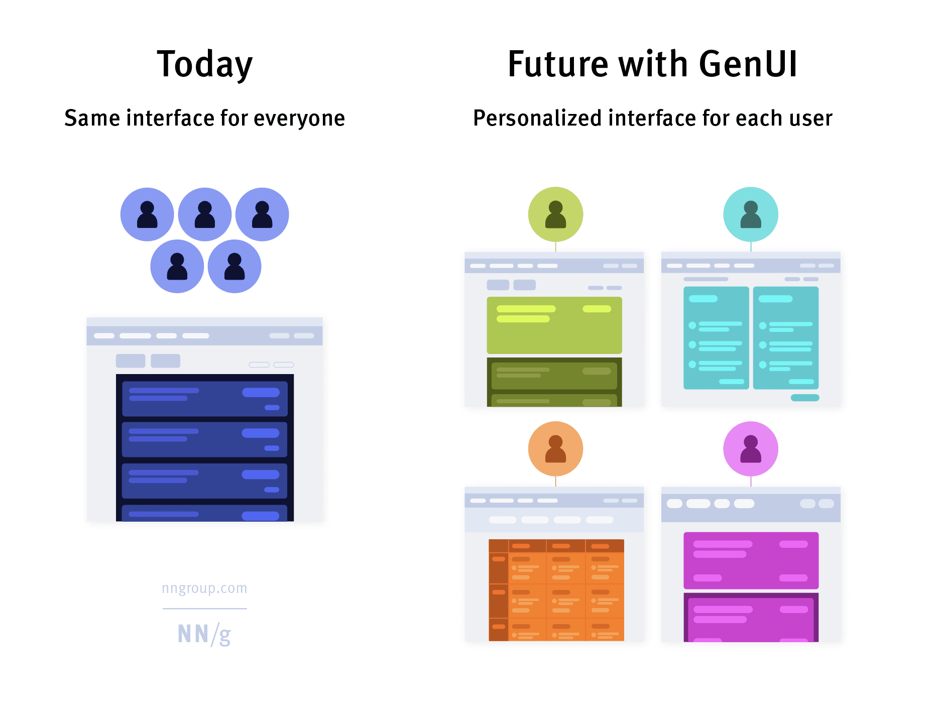
The interface is the first touchpoint with your customer, and it matters more than you think
In an age where AI and automation dominate conversations, it's easy to overlook the power of something as fundamental as the interface. The interface is your handshake with the user — the first impression, the first decision point, the first moment someone decides: "Do I trust this? Do I understand this? Can I do what I came here to do?" This project demonstrates that users got overwhelmed — not because the regulation was too complex, but because the interface failed to support real human behavior. By rethinking the interface — making it more intuitive, more self-explanatory — we didn't just improve usability. We cut support costs, increased completion rates, and restored user trust.