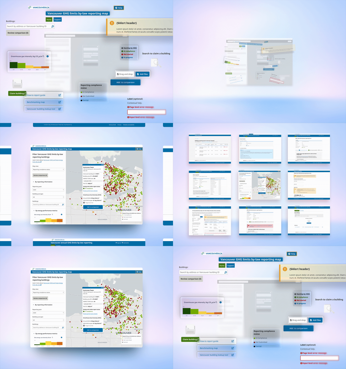
Unifying disjointed products into one cohesive design system
Creating a consistent and accessible UX across 5 digital touch points for a city-wide sustainability...
Timeline
Nov 2023 - Feb 2024
(4 months)
Team
- Business analyst
- Content strategist
- Third-party developers
Role
Lead UX Strategist · Researcher
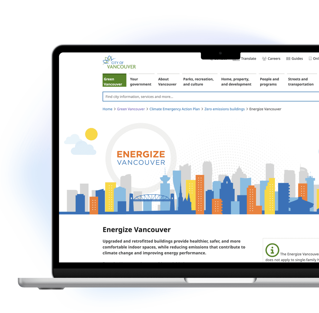
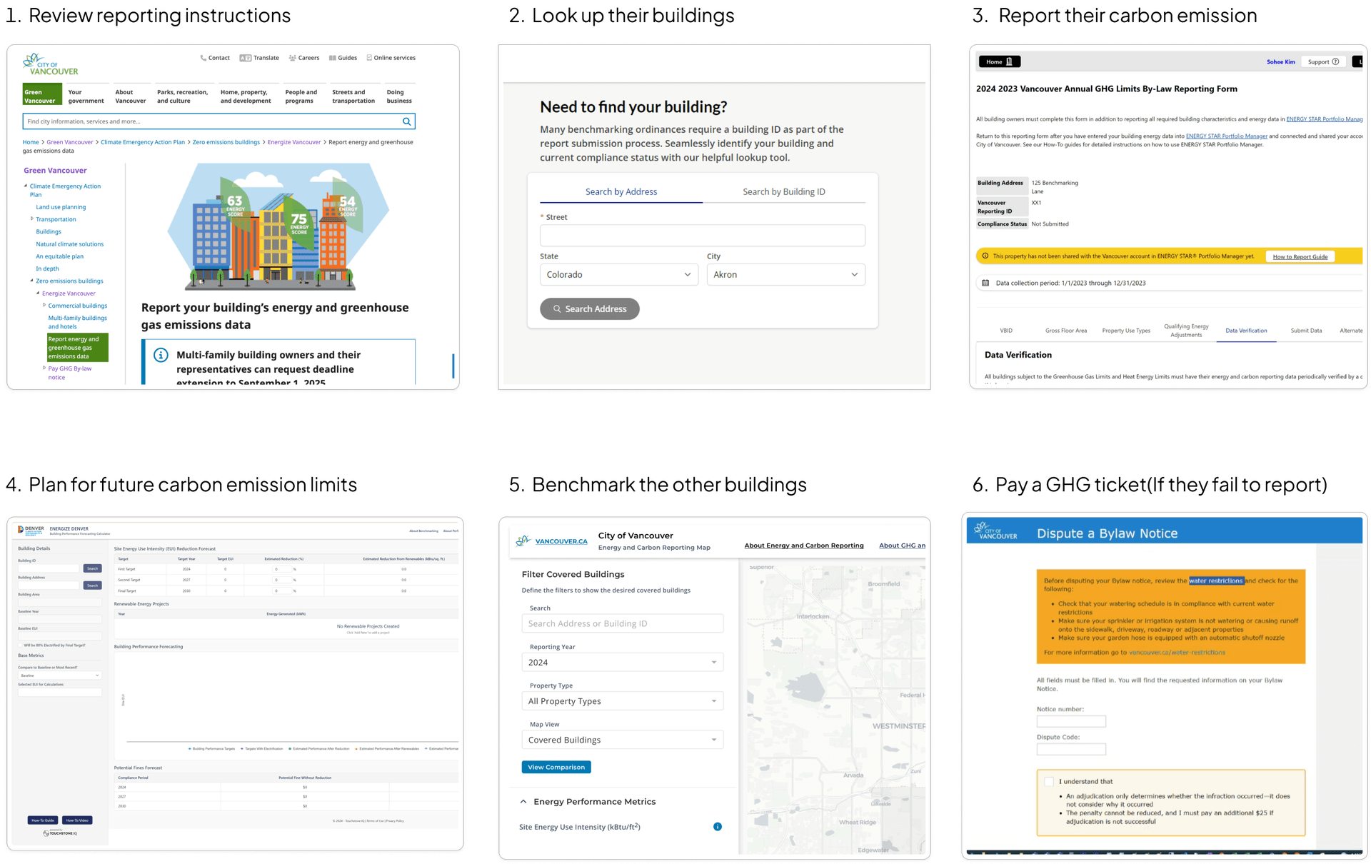
Energize Vancouver is a part of the city's sustainability regulations to reduce the carbon emission.
It's multi-step involved; to review guides, report, plan, benchmark, and pay a ticket based on one's...
A simplified all applications' connectivity
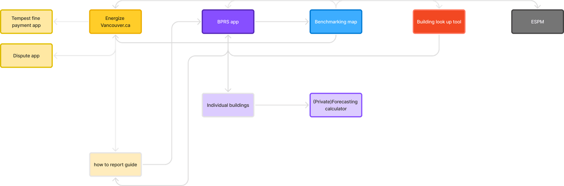
6 touch points, 3 vendors and 0 consistency. That raised a concern of city's brand reputation.
A standardized interaction patterns across all touchpoints
Component library
Applied City of Vancouver's design tokens consistently across all vendor tools
Navigation
Unified header and navigation patterns with clear way finding
Accessibility as a baseline
Improved color contrast, keyboard navigation, and screen reader support
Component library
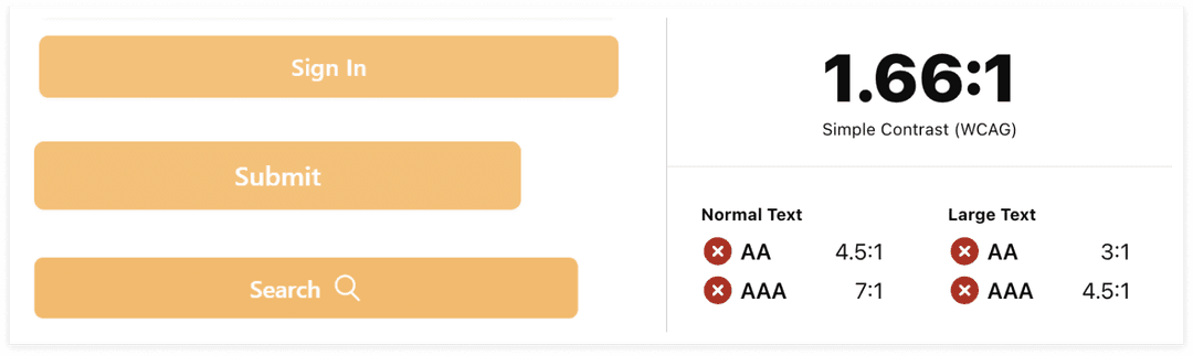
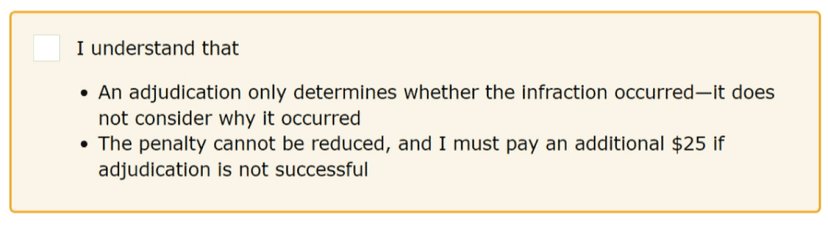
Lack of brand consistency, and accessibility risks:
- · Low color contrast
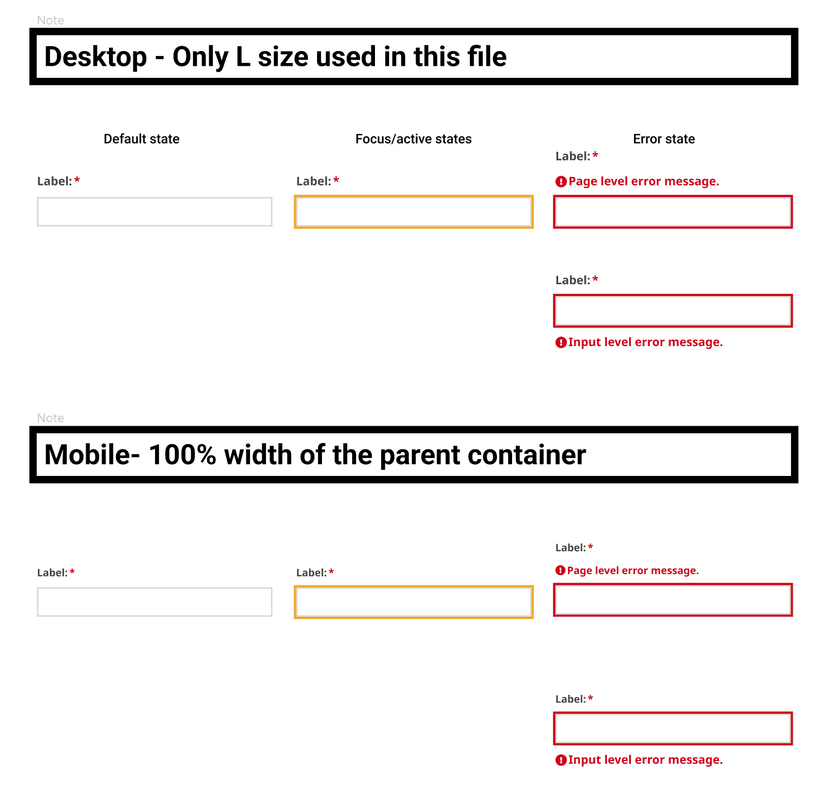
- · Missing focus/active/error states
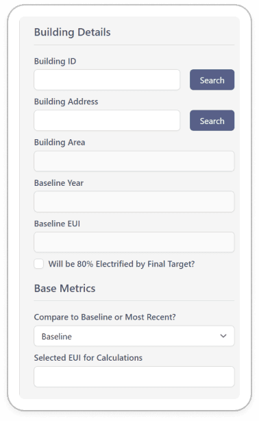
- · lack of consistency in the same roles
- · lack of hierarchy and visual distinct in different roles

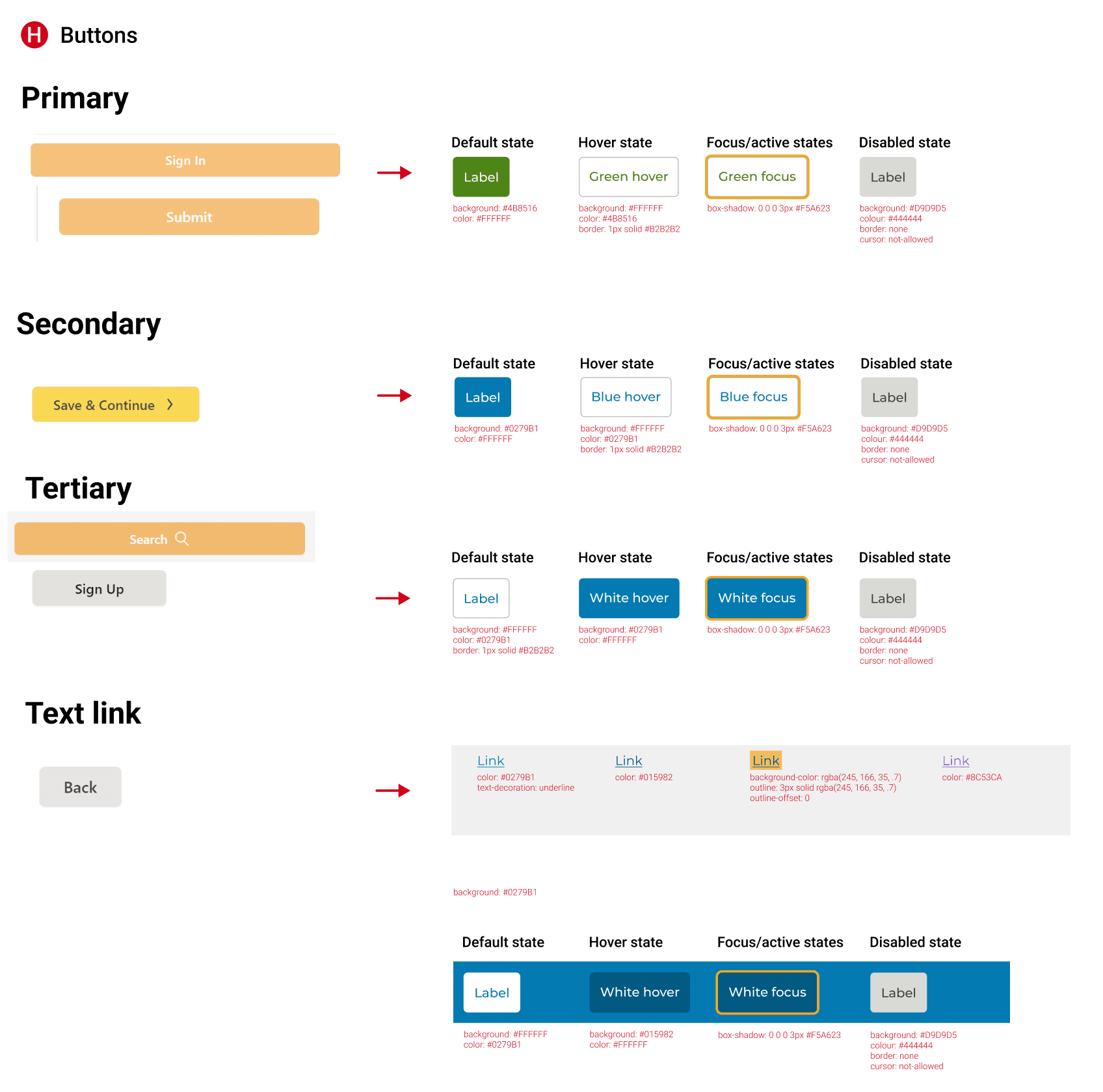
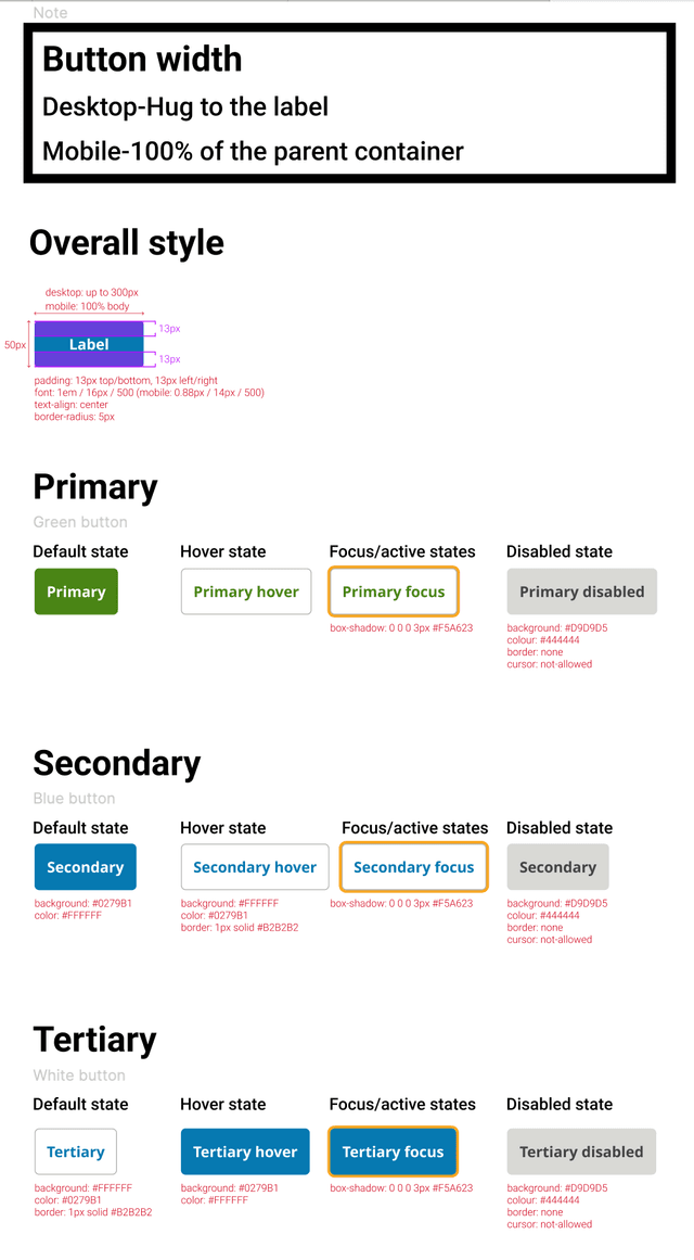
Improved on accessibility, structure, and brand consistency
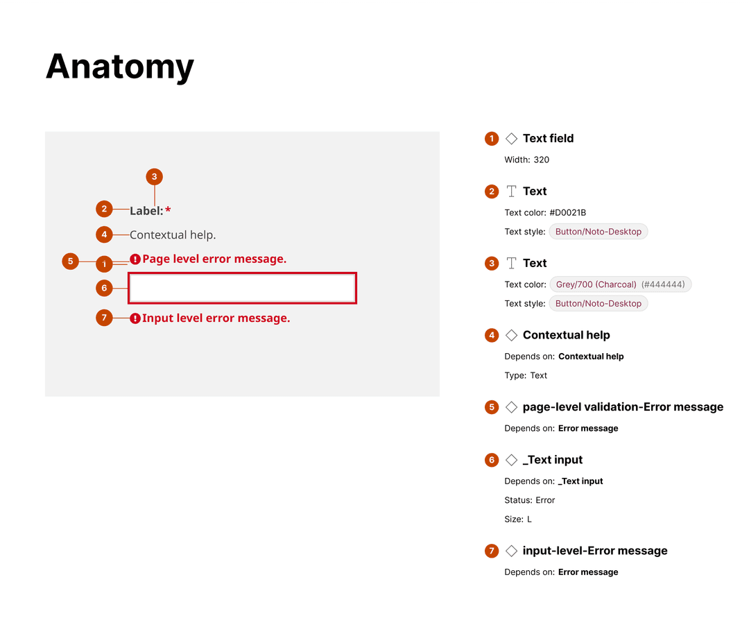
Buttons - ensuring the hierarchy based on the roles and all states are available
Input fields
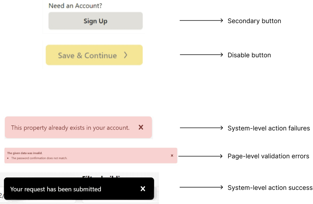
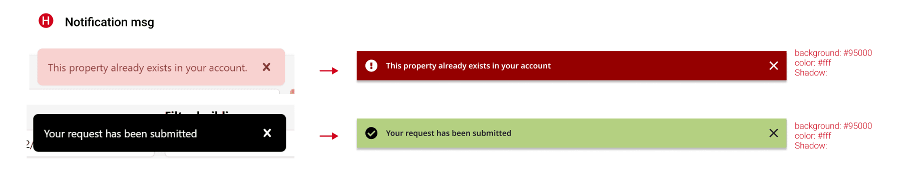
Error/success notification
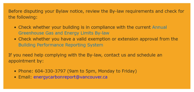
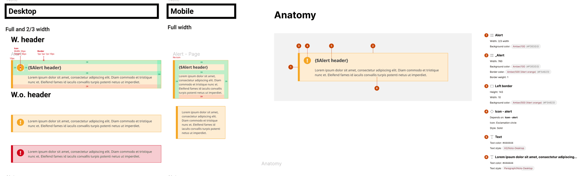
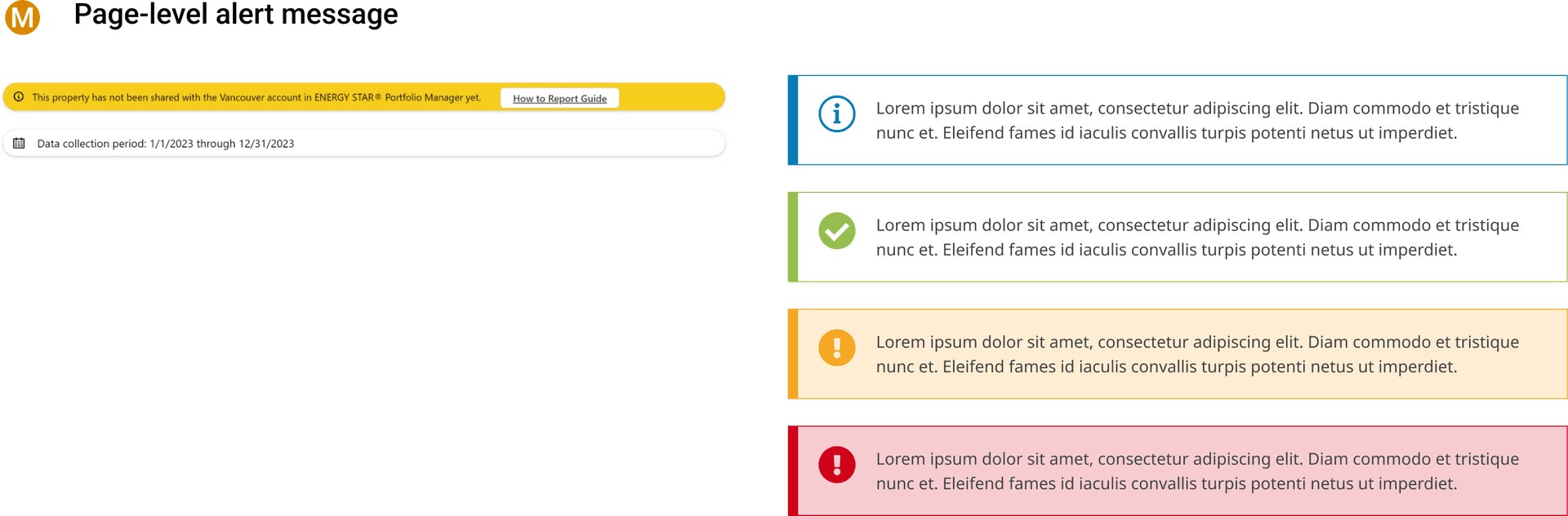
Page level alert
Navigation
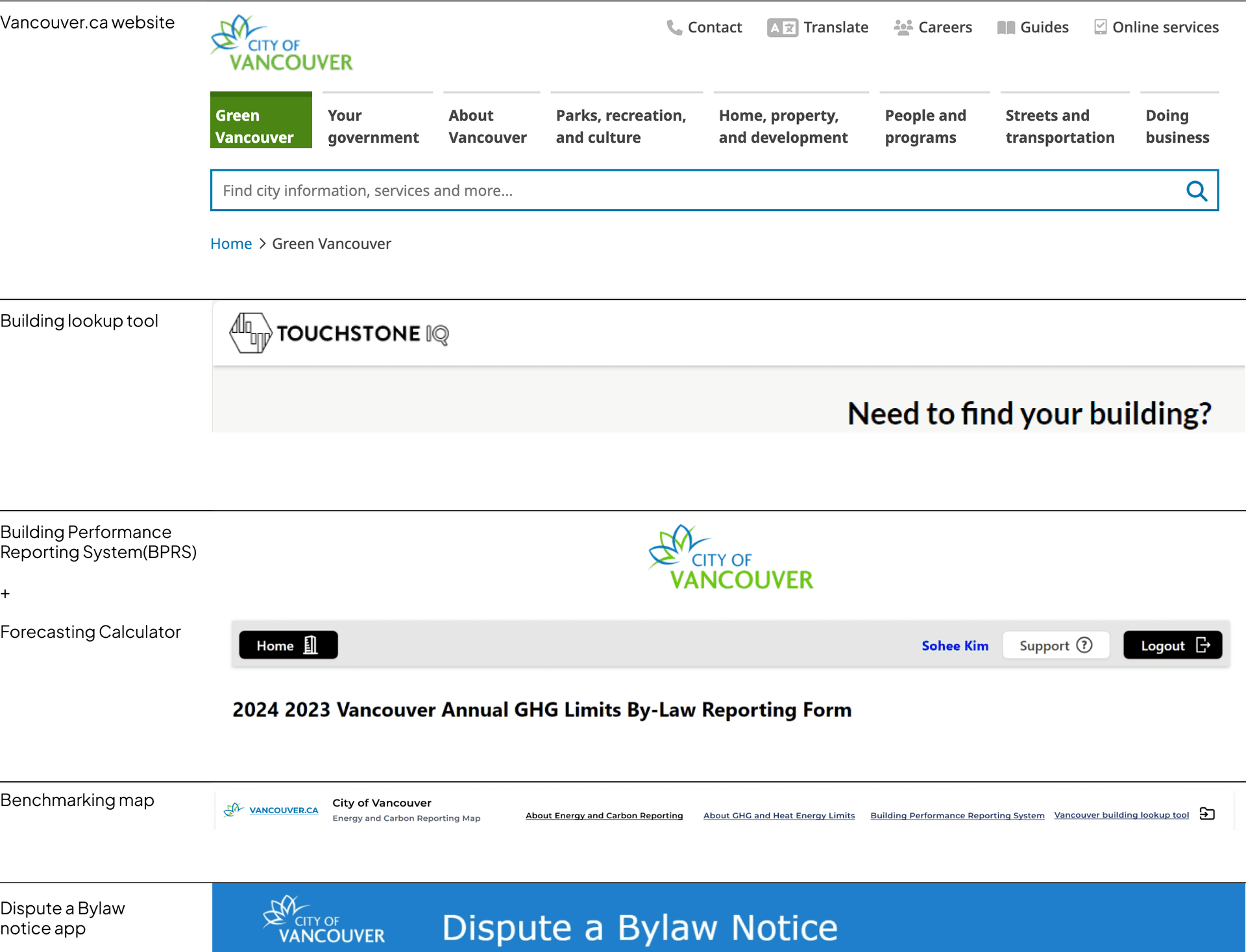
Disconnected navigation structure
Some tools had logos but no return link to the City's main site, others used third-party branding...
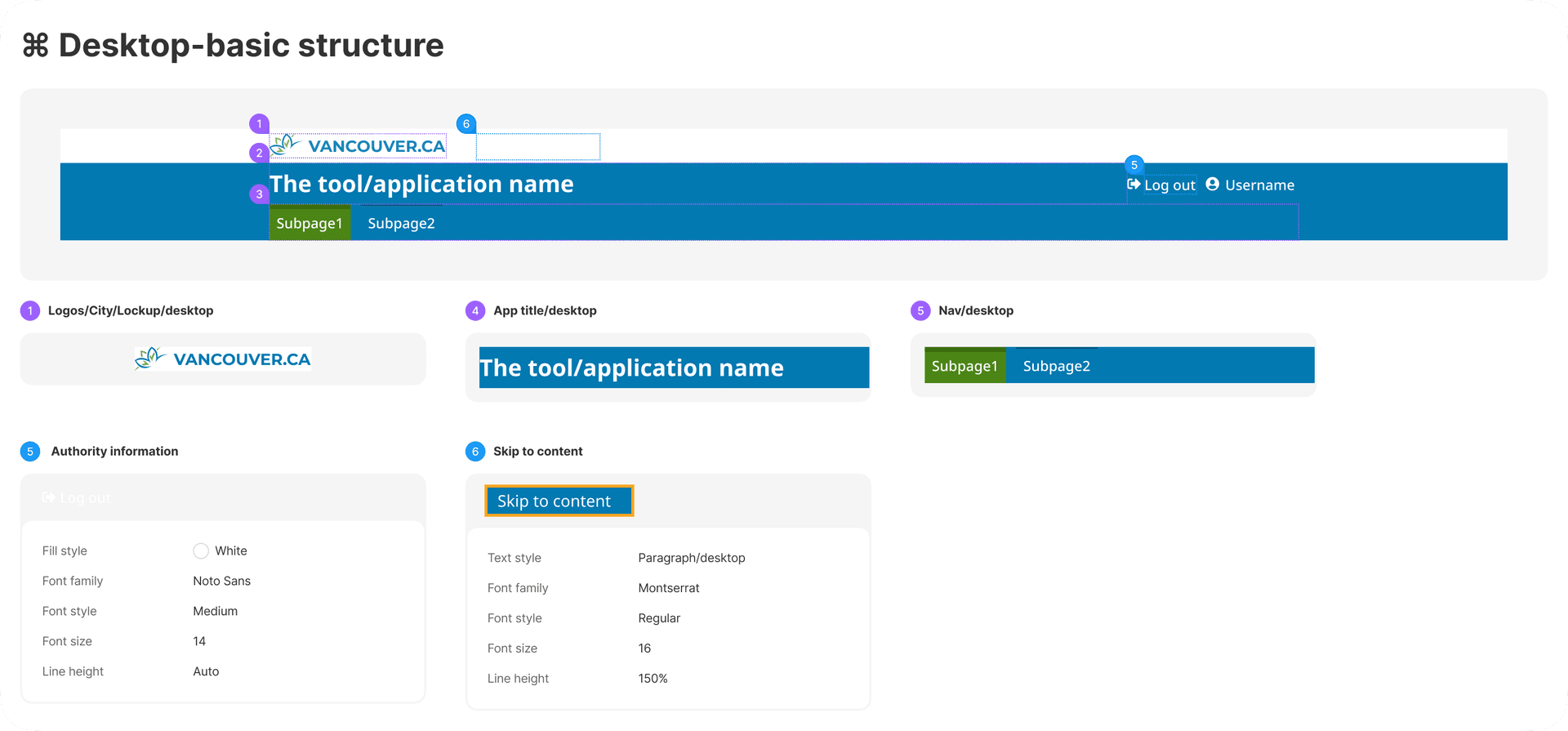
Mapped out the key elements that every tool include or must include in its navigation
City Logo
VANCOUVER.CA
All digital products must include the City of Vancouver logo in the top left with a return link to t...
Application title
Clearly labels which tool the user is in.
Sub-navigation
Nav item1, Nav item2, Nav item3
Internal subpages to navigate within the tool
Page title / External Links
Clear page-level heading and links to external tools or resources.
Login & Authority
Log out / Username
Show authenticated user state and role-based actions.
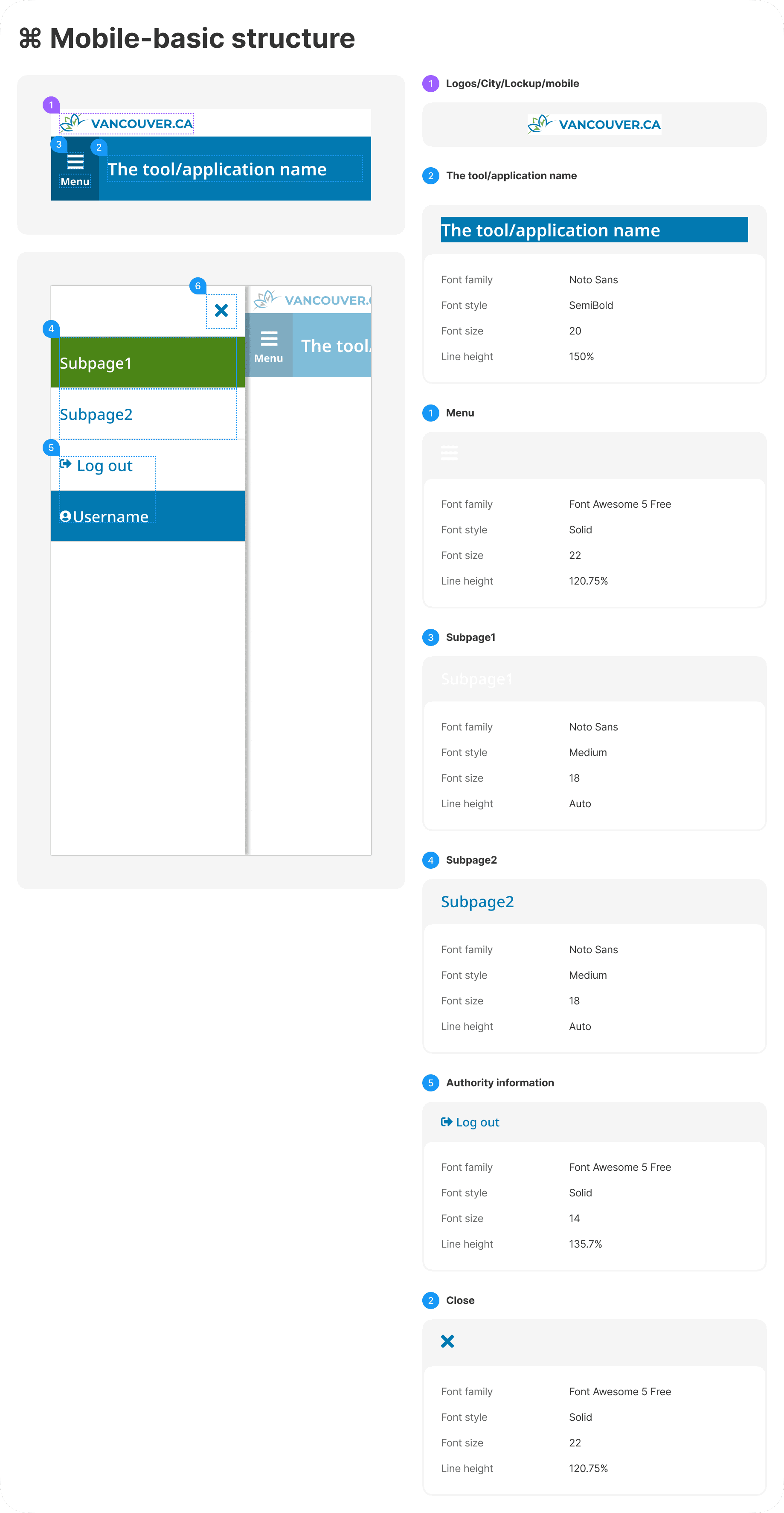
Standardized elements in navigation
Standardized elements like City logo, application title. sub-navigation for internal pages. Added Skip to content links...
Unified look and feel, following the same structure and visual language.
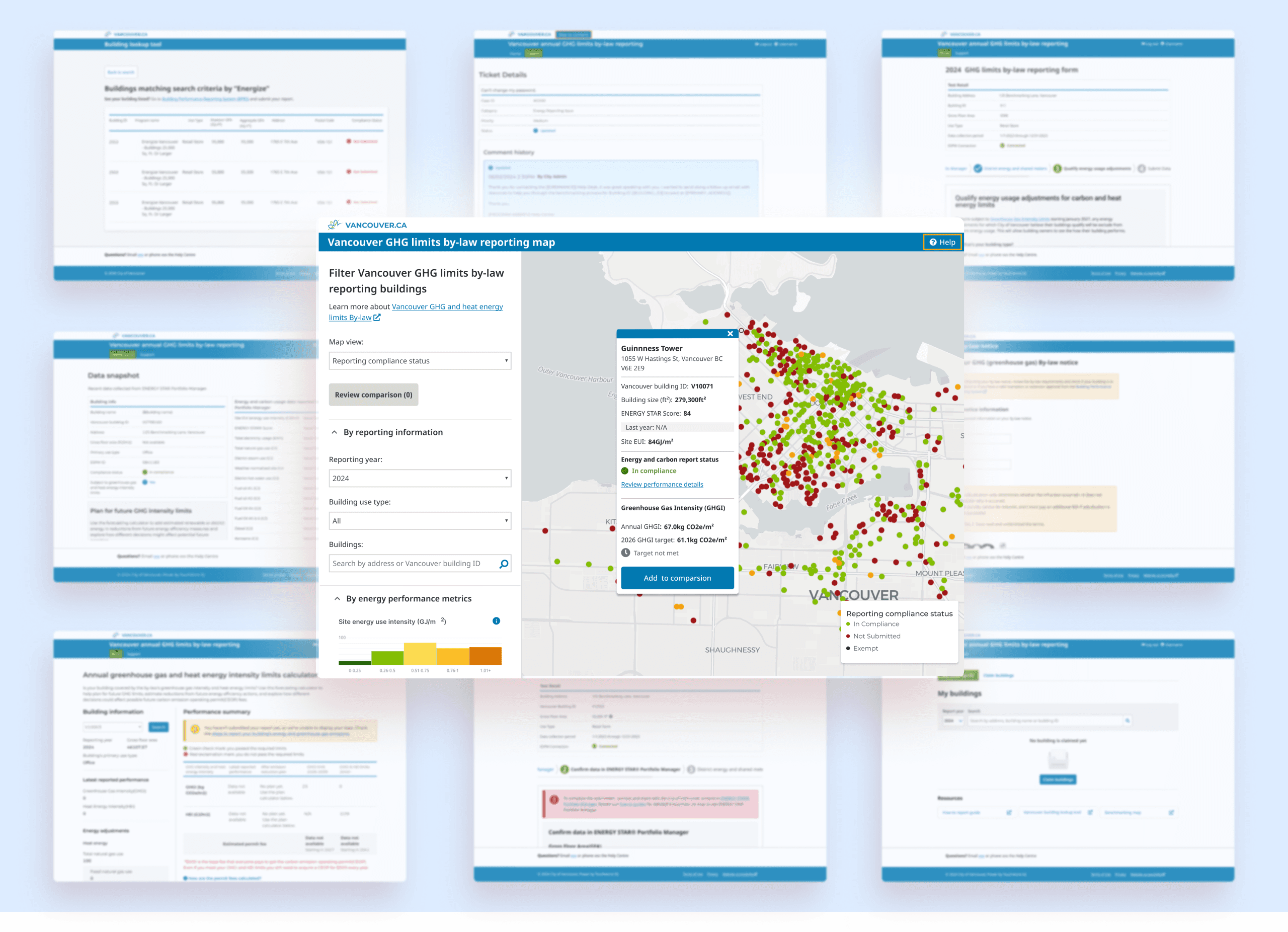
Building lookup tool / BPRS + Forecasting calculator
Benchmarking map / Dispute a Bylaw notice app
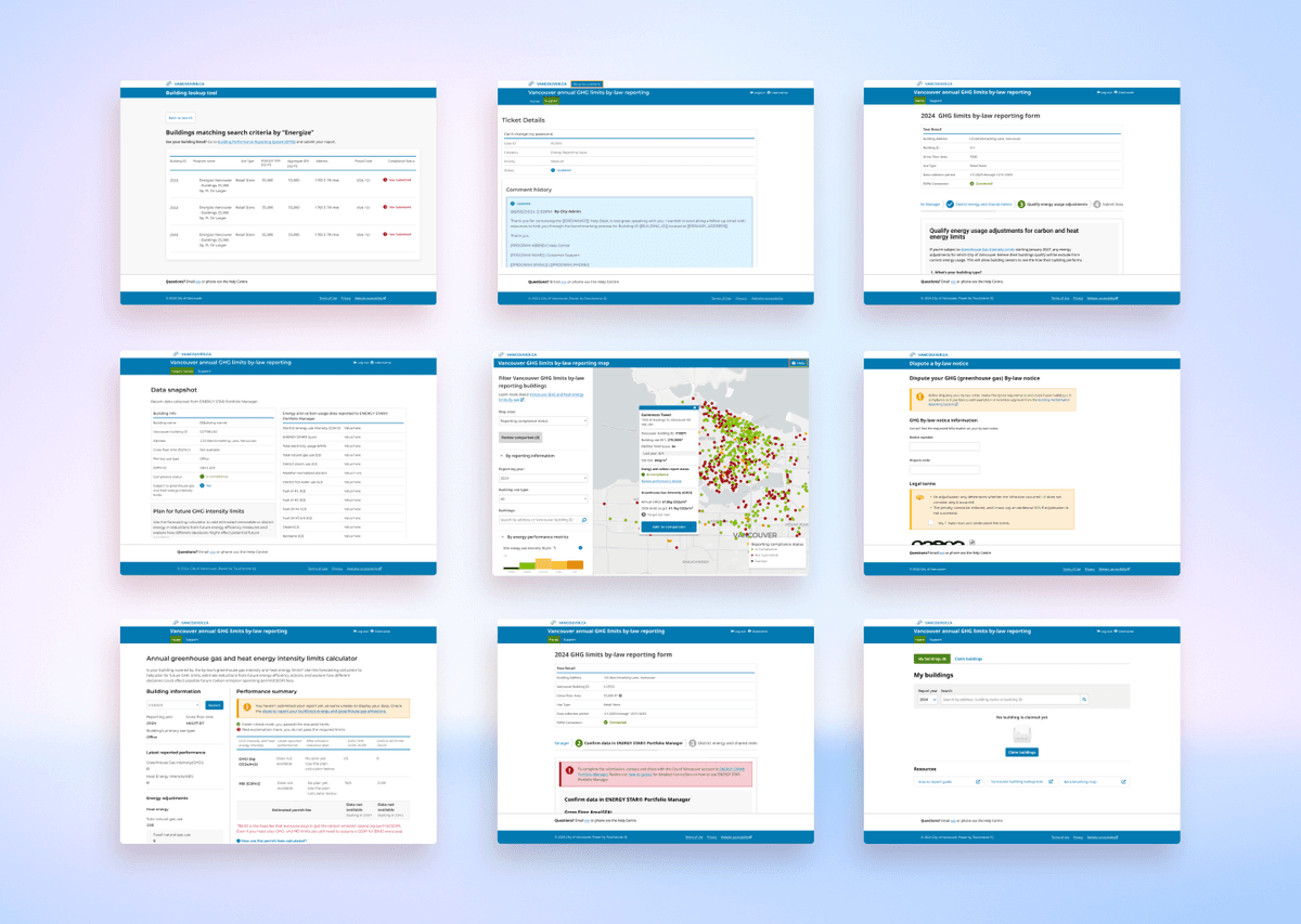
Turn a fragmented service experience into a unified, accessible ecosystem
Trusted brand as City of Vancouver a whole across 6 touch points
Aligned 6 digital tools under a cohesive visual and interaction model based on City standards
Achieved WCAG AA compliance across all touchpoints
Introduced WCAG-compliant focus states, semantic forms, and navigation support across platforms
Systems Thinking in Practice
This project taught me that system coherence isn't about making everything look the same—it's about creating familiar, accessible patterns that help people move through complexity with confidence.
By bridging disconnected tools, aligning them to a shared structure, and anchoring every decision in both user behavior and organizational goals, I helped lay the foundation for a more unified civic experience.
What started as a patchwork of vendor-built services is now a connected ecosystem—one that empowers users, reflects the City's values, and can scale sustainably over time.